Who uses this: Any FieldPulse user with the Pulse Dashboard tab in the web app’s left-side menu. Availability: FieldPulse web app.
The Pulse dashboard is the widget screen in FieldPulse that shows your current business activity at a glance — recent jobs, estimates and invoices, payments, and sales — the moment you open it. You choose which widgets appear and the order they sit in, so the numbers you check most are the first thing you see instead of something you go digging for.

Overview

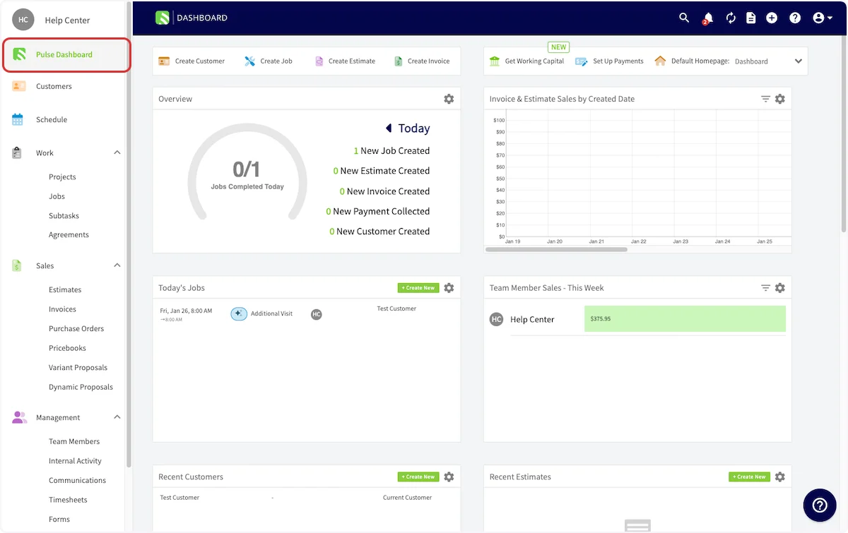
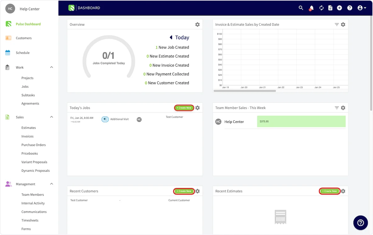
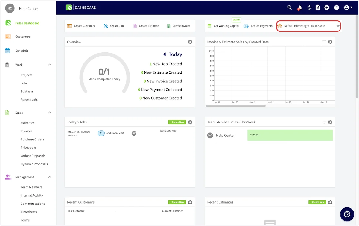
The Pulse dashboard opens from the Pulse Dashboard tab in the web app’s left-side menu, and it is part of FieldPulse’s dashboards and reporting. The Pulse Dashboard tab highlighted in the left-side menu of the FieldPulse web app, with the dashboard's widgets on screen The Pulse dashboard shows a set of widgets, each with recent activity for one part of the business — widgets like Today’s Jobs, Recent Invoices, Payments Collected, and Team Member Sales. Some widgets include a + Create New button, so you can start a new job, customer, estimate, or invoice without leaving the dashboard. Create New buttons highlighted on the Today's Jobs, Recent Customers, and Recent Estimates widgets of the Pulse dashboard
How it works

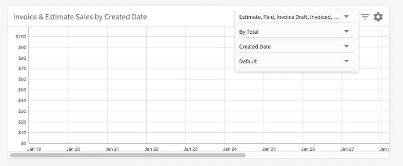
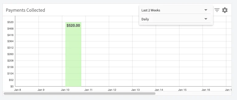
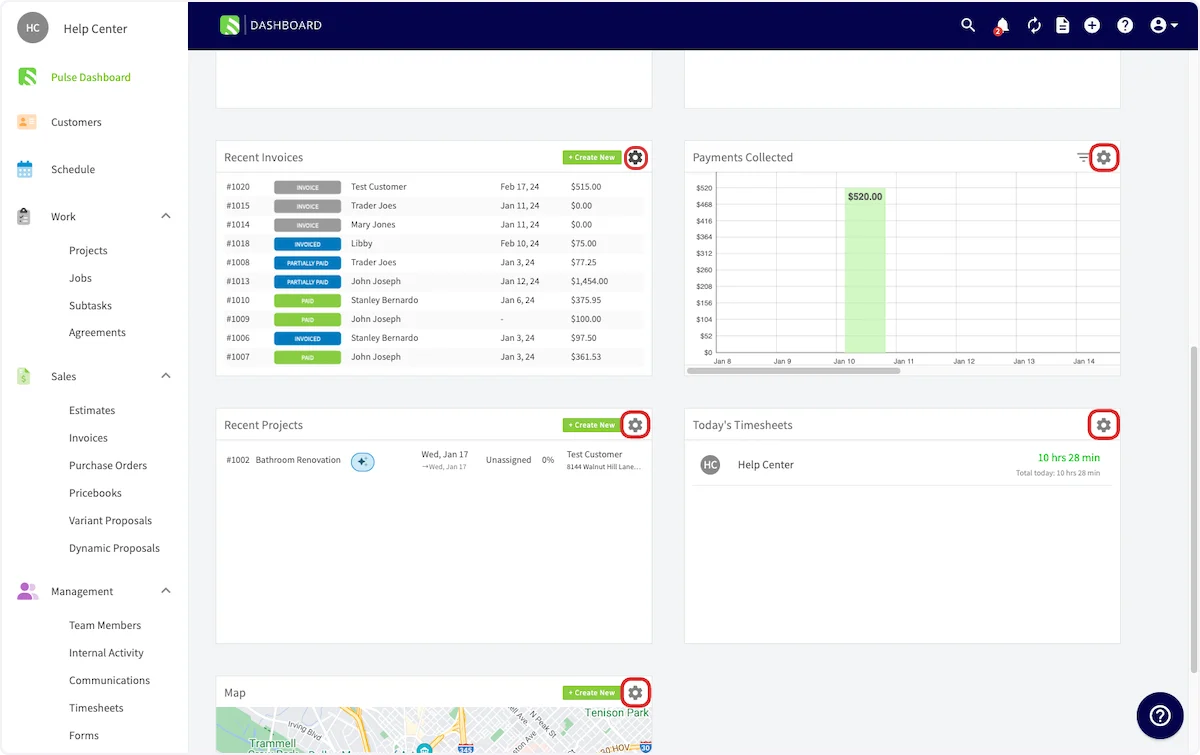
The workflow breakdown the Pulse dashboard solves is not knowing where the business stands without opening five different screens to find out. Instead of checking jobs, then invoices, then payments one at a time, you see the current picture in one place at login. The Pulse dashboard is customizable in three ways: Set it as your default homepage. Select the Default Homepage dropdown at the top of the dashboard to land on the Pulse dashboard when you log into the web app. The other homepage options are Team Schedule, Team Timesheets, Estimates, Invoices, Customers, and Projects. The Default Homepage dropdown highlighted at the top of the Pulse dashboard Choose and order your widgets. Each widget has a gear icon — select it to delete a widget you don’t need, or to move widgets into the order you prefer. Gear icons highlighted on the Recent Invoices, Payments Collected, Recent Projects, Today's Timesheets, and Map widgets Filter the chart widgets. In the Payments Collected and Invoice & Estimate Sales by Created Date widgets, select the gray filter lines next to the widget’s gear icon, then choose the parameters you’d like to filter the graph by.
The Invoice & Estimate Sales by Created Date widget with its filter dropdowns open for record type, total, and date
The Payments Collected widget with its filter dropdowns open to the date range and interval options
Every change you make — filtering, moving, or deleting widgets — is saved, so the Pulse dashboard looks exactly the way you set it up the next time you visit. When you’re ready to go further — adding reports you built yourself, choosing each widget’s date range, and resizing widgets and rows — turn the Pulse dashboard into a custom reporting dashboard. See How to Build and Configure the Custom Reporting Dashboard.

Availability

The Pulse dashboard lives in the FieldPulse web app, on the Pulse Dashboard tab in the left-side menu. To make it the first screen you see when you log in, set the Pulse dashboard as your default homepage with the Default Homepage dropdown.